A Bold Brand for a People-First Movement
Tennessee for All
Industry: Advocacy, Grassroots Organizing
Scope: Brand Identity • Hand-Drawn Logo • Color System • Collateral Design


THE APPROACH:
Inspired by the radical optimism of the '60s peace movements, I knew this brand couldn’t play it safe. It had to feel like change.
1. A Hand-Drawn Identity With Soul
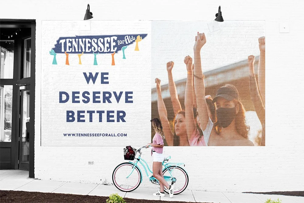
The logo? No sterile vector work here. It’s hand-drawn, raw, and real—just like the work this org is doing on the ground. Each hand holding up the state of Tennessee is unique, representing the diversity of voices behind the movement.
2. Vintage Colors, Modern Rebellion
The palette nods to vintage protest posters—warm, grounded, and nostalgic—but used in bold ways to command attention today.
3. Design With a Voice
From typography to submarks to collateral, everything was built to look grassroots but feel intentional. It’s design that doesn’t just look good—it stands for something.
THE CHALLENGE:
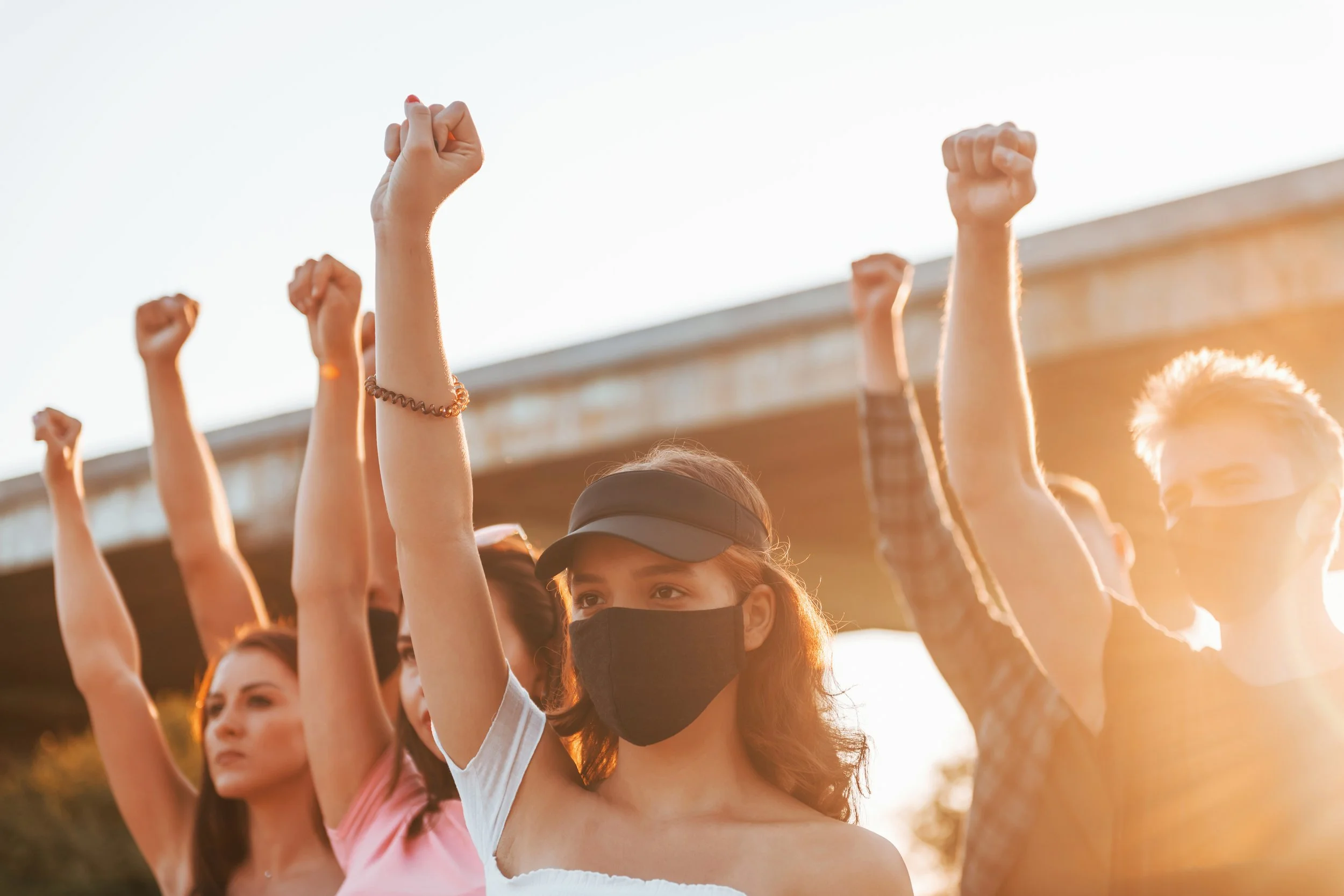
Tennessee for All came in hot—with a clear mission but no visual presence to match. Their grassroots movement fights for better jobs, stronger public schools, and a Tennessee where people matter more than profit. The brand needed to feel like a rallying cry—not another cookie-cutter nonprofit.
HAND-DRAWN LOGO
COLOR SCHEME

WHAT WE DELIVERED:
Full Brand Identity
Hand-Drawn Primary Logo & Sub-Logo
Vintage-Inspired Color Palette
Typography & Visual Language
Supporting Collateral for Movement Materials
THE TRANSFORMATION:
Tennessee for All now shows up with clarity and confidence. Their brand reflects their rebellion—and invites others into it. It’s not just a logo. It’s a flag people can rally under.
BOTTOM LINE:
This is what happens when design meets purpose.
A people-first brand with heart, grit, and guts—just like the movement it represents.