FRAN ROMEO AGENCY
A Legacy Brand With Stage Presence
Client: Fran Romeo Agency
Industry: Entertainment Booking & Talent Management
Scope: Brand Identity • Logo Design • Typography & Color System
THE CHALLENGE:
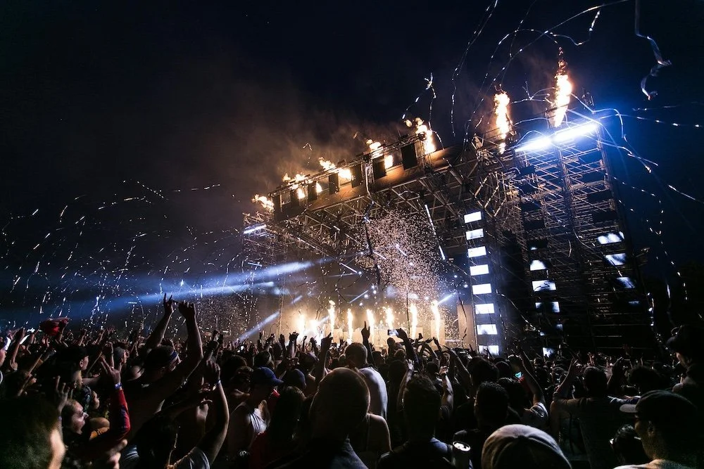
With over 27 years of experience booking top-tier entertainers, Fran Romeo didn’t just need a logo—she needed a crown. Her agency is a powerhouse in the live entertainment space, but her visual identity hadn’t caught up with her reputation. She needed branding that communicated boldness, authority, and that unmistakable “headliner” energy.
THE APPROACH:
Fran is a force—equal parts feminine and fierce. We made sure her brand looked the part.
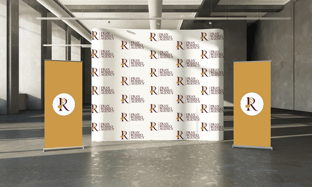
A Logo That Speaks Her Name (Literally)
We built the identity around her name, combining it with a refined music symbol to instantly signal industry relevance. The result? A logo that’s clean, iconic, and unmistakably hers.Royal, Not Flashy
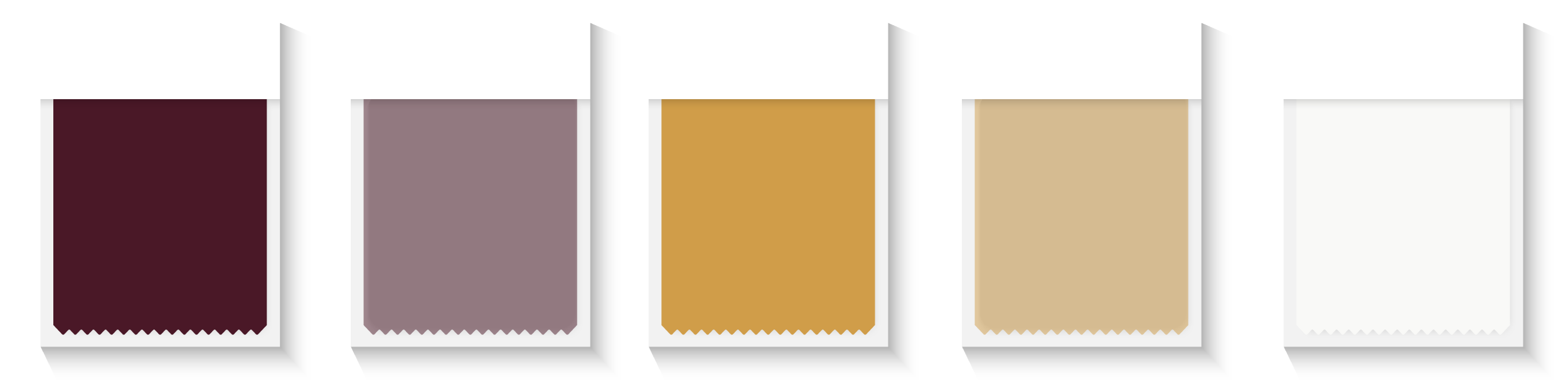
We ditched gimmicks for gravitas. The color palette evokes royalty—deep, rich tones that suggest legacy and leadership, not fleeting trends.Authority in Every Pixel
Everything about the design had to feel intentional. From typography to spacing, this was about crafting an identity that could stand next to the biggest names in entertainment—and hold its own.


WHAT WE DELIVERED:
Custom Logo Design
Typography & Color Palette
Brand Strategy Rooted in Leadership & Legacy
Scalable Design for Web, Print, and Event Use
THE TRANSFORMATION:
The Fran Romeo Agency now shows up with the same presence online as it does backstage. The new identity honors her decades of experience while setting the stage for the next era of entertainment excellence.
Primary Logo
Logo Mark
Secondary Logo
Logo Type

Color Scheme
Font Choice

BOTTOM LINE:
This wasn’t just a rebrand. It was a coronation.
Fran Romeo’s visual identity now reflects exactly who she is: a legend in her lane, and a leader in the industry.