Choosing a Palette That Speaks to Your Audience
Your Brand Colors Aren’t Just a Vibe—They’re a Weapon (Use Them Like One)
Here’s the truth no one wants to say out loud: most brand color palettes look like they were picked during a wine-fueled Canva scroll. Soft pinks, soothing beiges, and those same five shades of sage green. Yawn.
Color is the first thing people notice—before they read your name, your tagline, or your “About Me” monologue. But most people are out here designing mood boards for themselves, not their audience. That’s why their brand looks like a Pinterest board instead of a business with a spine.
Let’s get something straight:
Your color palette isn’t about your personality. It’s about your positioning.
Color Isn’t Cute—It’s Psychological Warfare
Color hits faster than logic. It’s primal. You don’t “like” red—you respond to red. That’s the whole game.
Here’s a brutally honest breakdown:
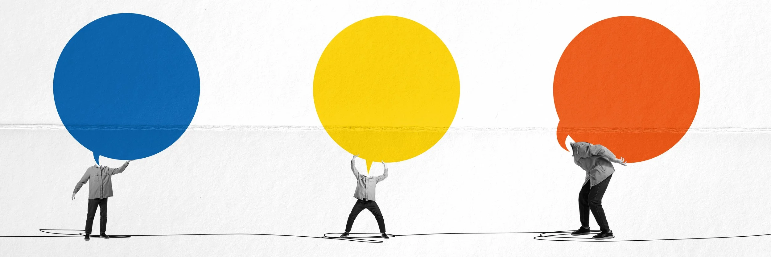
Red = Disruption. Urgency. Blood, sweat, and sales. Use it when you want to slap someone’s attention awake.
Yellow = Youth, optimism, borderline chaos. It’s not subtle, it’s sunshine with a megaphone.
Green = Nature, money, balance. The “trust me, I’m grounded” move.
Blue = Trust, authority, and calm control. It’s the corporate comfort zone—used when you want to look “safe” and credible. But be careful: it can also scream “boring” if you don’t punch it up with contrast.
Purple = Weird, wise, or woo-woo. It signals depth or drama—no in-between.
Black = Power play. It’s not “elegant,” it’s “don’t f*ck with me.”
If you’re picking colors based on “what feels aligned,” you’re missing the point. Alignment doesn’t mean “what matches your aura.” It means “what makes your ideal client stop, stare, and click.”
Still Choosing Colors Based on Your Favorite Sweater? That’s Why You’re Blending In
You’re not your brand’s target market. I’ll say it louder:
Just because you love lavender doesn’t mean it belongs on your rugged-as-hell coaching biz for burned-out execs.
Instead of “What do I like?” ask:
What do I want people to feel the second they see me?
What’s the emotional state my audience is in—and how do I visually meet them there?
Which brands are dominating my industry and how are they using color to do it?
Because if your colors don’t trigger a reaction, they’re just wallpaper.
Authenticity Isn’t an Excuse for Aesthetic Confusion
Look, I’m not saying sell your soul and use colors you hate. But there’s a difference between “authentic” and “self-indulgent.”
If your brand is all moody forest greens and black-and-white everything, but your audience is craving softness and healing, you’re making it harder for them to trust you. You can still bring the edge—but refine it.
Compromise isn’t weakness. It’s strategy.
Here’s What to Do Instead (AKA The Fixes)
Start with the emotion, not the hue. Pick 2-3 core feelings you want your audience to have. Work backward into color.
Audit your competitors. What colors are dominating in your niche—and how can you disrupt them instead of copy them?
Choose 1 bold anchor color. Something that punches through the noise. Then balance it with neutrals that don’t dilute it.
Test in the wild. Don’t finalize anything in Canva. Throw your palette into your feed and see if it gets clicks, saves, DMs.
Burn the beige. Unless you’re a minimalist interior designer or an oat milk brand, stop hiding behind “neutral.”
The Bottom Line
Your colors should polarize. They should spark a reaction. They should be chosen like weapons, not wallpaper.
The safest choice is the least memorable one. So pick a color that starts a conversation—or prepare to be forgotten.